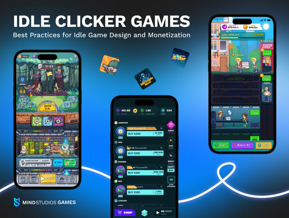
First Impressions Are Everything
Mobile players are ruthless. If your game doesn’t make a clear, instant first impression, they’ll uninstall in under 30 seconds. Unlike PC or console players, mobile users are often distracted, on-the-go, and impatient.
A cluttered main screen, tiny buttons, confusing icons, or lack of onboarding can ruin the experience before gameplay even begins. Good UX makes every interaction effortless, fast, and rewarding — especially during the first launch.
Navigation Dictates Retention
Players should never wonder: “Where do I go next?” or “How do I equip this item?”
UX mistakes like too many menu layers, poor hierarchy, or unclear icons cause drop-offs. Good mobile games use:
- Minimal tap flows (2 taps to action max)
- Persistent navigation menus
- Intuitive gestures (swipes, drags)
- Highlighting or nudging new features
If your players need a tutorial for the UI itself — you’ve already failed. Retention dies when frustration creeps in.
Monetization Depends on UX
Want people to buy skins, unlock power-ups, or watch ads? UX design directly controls revenue.
For example:
- Rewarded ads should appear contextually (after a loss, at checkpoints)
- IAP shops should be fast to access and pleasant to browse
- Popups should follow timing logic, not interrupt gameplay randomly
- Offers must look visually appealing and clear in value
A polished, frictionless experience makes players want to spend — not feel tricked into it.
Emotional Flow = Player Loyalty
Great UX design creates a flow state. Buttons feel satisfying. Transitions are smooth. The game feels alive. This emotional engagement is what turns a casual player into a fan.
Games like Monument Valley, Brawl Stars, and Clash Royale shine not just because of gameplay — but because every tap, swipe, and transition feels perfectly tuned.
Sound, haptics, animation, and micro-interactions build this invisible magic. Neglecting them leads to a sterile, forgettable experience.


No responses yet